Eating with Chloe was named after its founder. That was an asset for a personal recipe following and a liability for what the business was becoming: a subscription platform with several food creators contributing, sold to people who had never heard of Chloe Condon. The name described the author instead of the product, and there were no written rules for anybody else to apply it.

From a founder's name to a brand a whole platform could stand on.
From founder name to platform brand
Eating with Chloe was named after the person who made the recipes. The business being built needed a name that described the product, a system other people could work inside, and an identity that would still read clearly at the size of an app icon. PixelForce rebuilt the brand from the name outwards, then handed over the rules that let the product be designed on top of it.
Concept directions 2
Logo suite formats SVG, PNG, JPG, EPS
Brand in market June 2026
The Problem
The Solution
PixelForce rebuilt the brand as a discrete engagement ahead of any product work. Two concept directions were presented and narrowed to one, then developed into a full logo suite, a defined colour system and a written guideline covering colour values, typography, logo usage and tone of voice. Accessibility was a requirement in the brief rather than a later check, so the palette was set against WCAG contrast standards to hold up inside an app brand, not only on a moodboard.
The Outcome
The brand was delivered in July 2025 and has carried into the product it was designed for. The Recipe Hub app went live on 23 June 2026 with the same wordmark, palette and voice, and the original Eating with Chloe site now points its members to it. Having the brand system settled first is what let the app be designed without relitigating colour, type or tone.
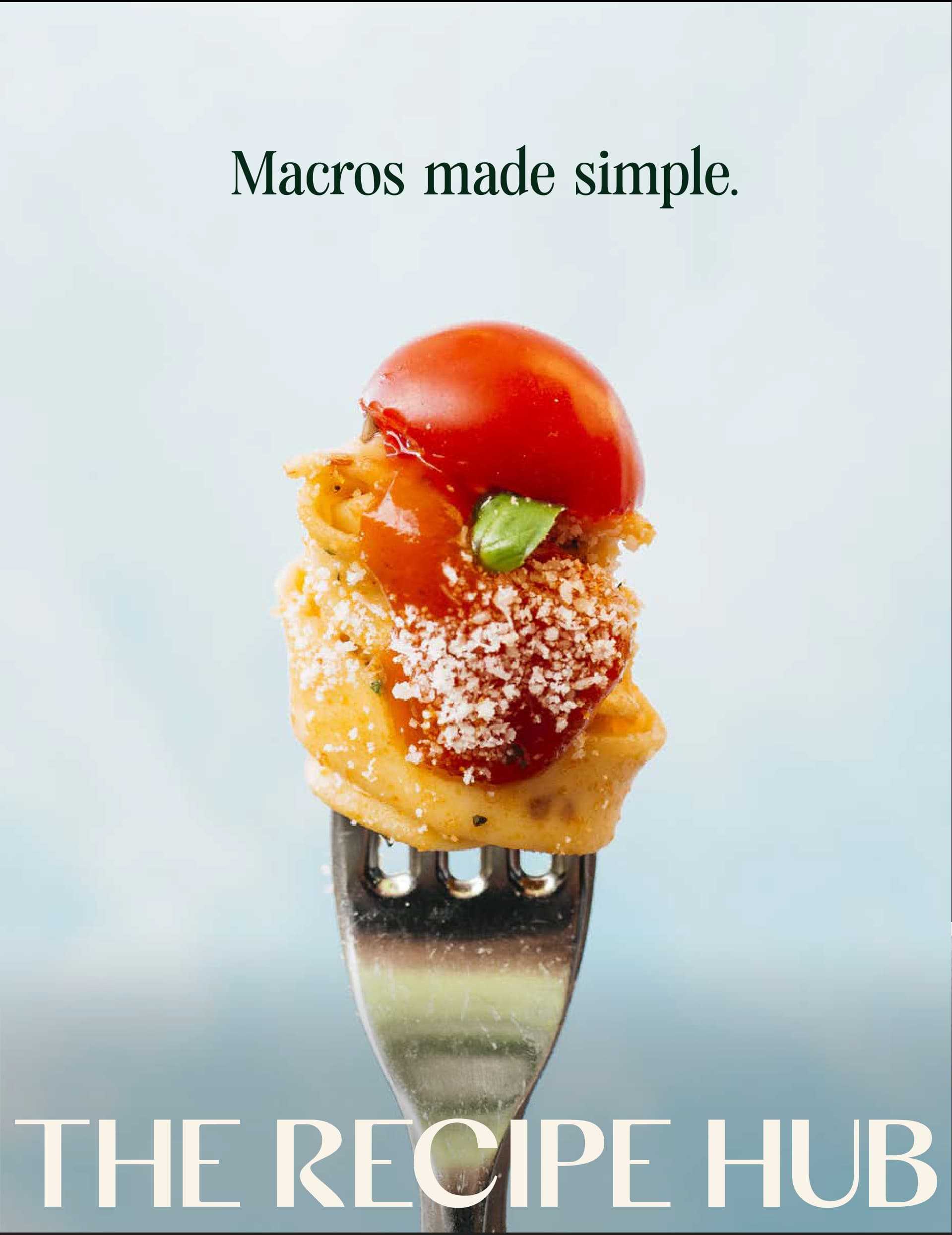
Why the brand had to change first
The Recipe Hub began life as Eating with Chloe. Chloe Condon is an online nutrition coach whose macro-friendly recipes built a large and active Australian following, and for a personal content brand her own name was the strongest asset she had. The plan for the business was bigger than a personal content brand. Working with business manager Shawnee Prier, the intention was to move to a subscription platform, bring other food creators in alongside Chloe, and sell to people who had never seen her social media.
That plan exposed the limit of the existing name. A brand built around one person does not stretch to a roster of contributors, and it tells a prospective subscriber nothing about what the product actually does. PixelForce was briefed in June 2025 to rebuild the brand rather than tidy it up: a new name in market, a distinct identity, and a written system that a designer, a developer or a guest recipe creator could all work from without pulling it apart. The brand needed to be settled before product design started, because everything the app would eventually look like would be built on top of it.
A name that described the author
Eating with Chloe put the founder at the centre. The business plan called for several contributors and for subscribers who had never followed her.
Nothing written down
There were no agreed colour values, type rules or tone guidance, so every new asset was a fresh judgement call and the brand drifted a little each time.
It had to survive an app
The identity was going to live at small sizes on phone screens, which made contrast and legibility constraints on the design rather than refinements after it.
Room to grow into
The brand had to stretch across marketing, social and the product itself without needing a second rebrand once the platform launched.
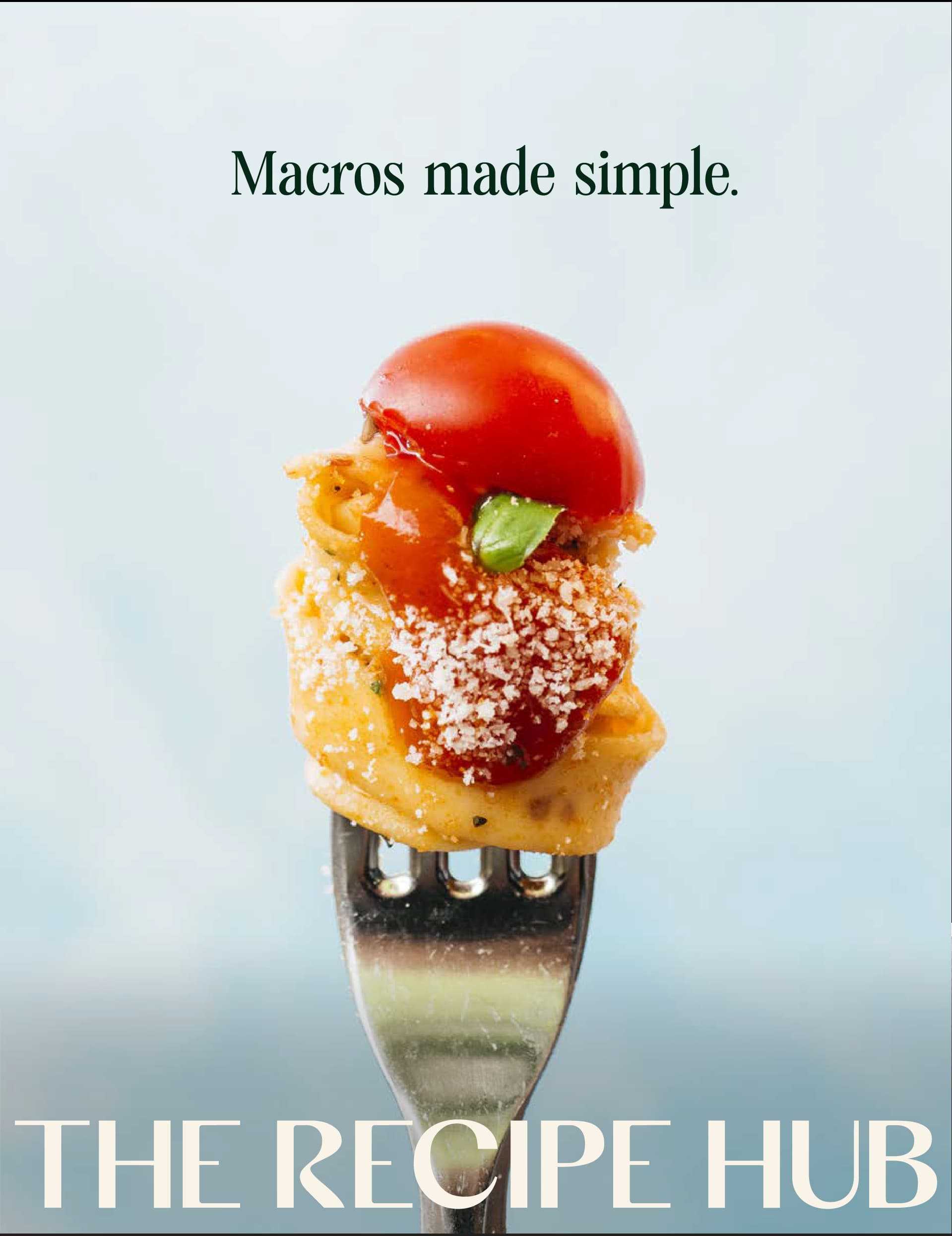
The engagement ran remotely with a small, fixed team - a project manager and a designer working directly with Chloe as founder and Shawnee as business manager. Concepts were presented for review in rounds rather than drip-fed, so feedback arrived as a decision rather than a running commentary. Because the brand had a commercial deadline behind it, each stage carried a date and a named owner.
Hinney Lo Founder & CEO, PixelForce
A return brief is the cheapest part of a branding project and the part that decides whether the rest of it works. Writing down what the brand is arguing for, and having the client agree to it before anything is designed, is what stops a rebrand becoming a matter of taste.
Swipe to explore
How the brand was built
PixelForce ran this as a discrete branding engagement ahead of any product work, on the same principle the development side follows: the blueprint comes before the build. The first deliverable was not a logo but a return brief - a written interpretation of the brand, its audience, its single-minded proposition and its tone, put back to the client for sign-off. Nothing was designed until that document was agreed. It is a cheap step that prevents the expensive kind of disagreement, because it settles what the brand is arguing for before anyone commits to how it looks.
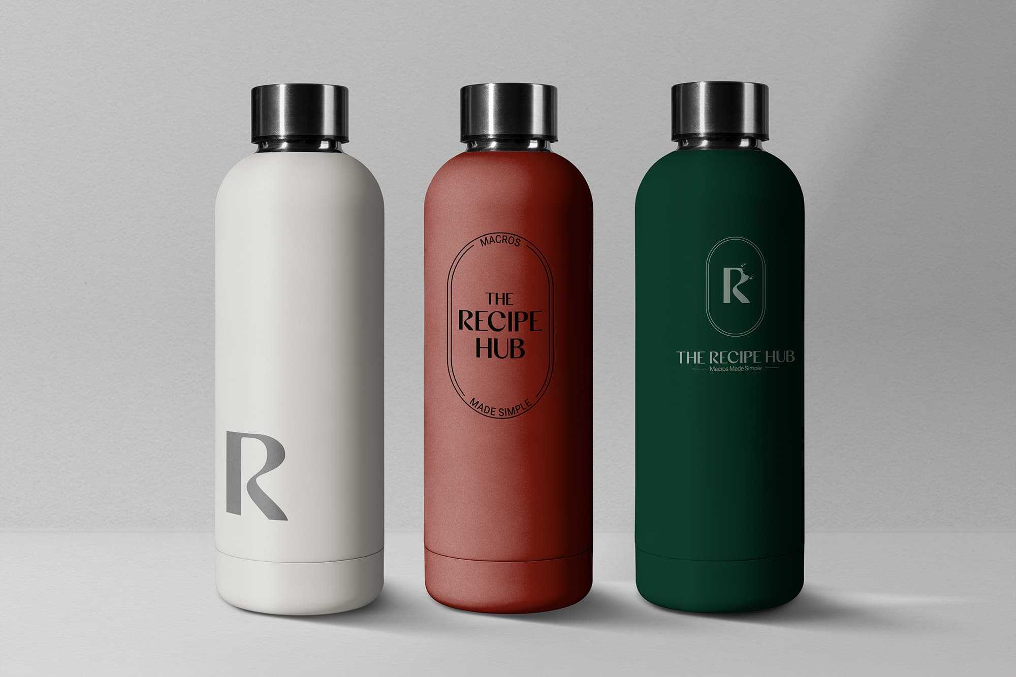
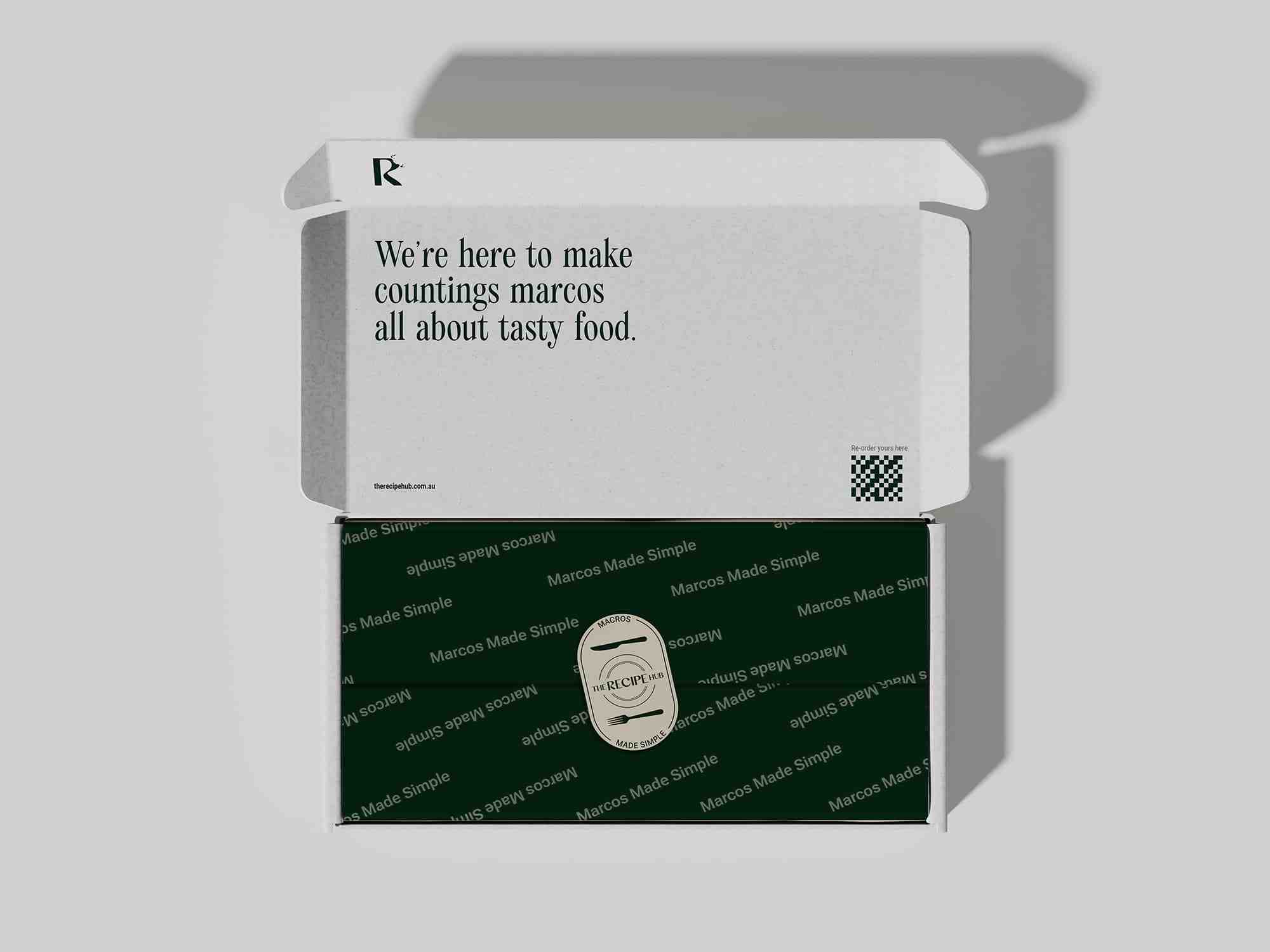
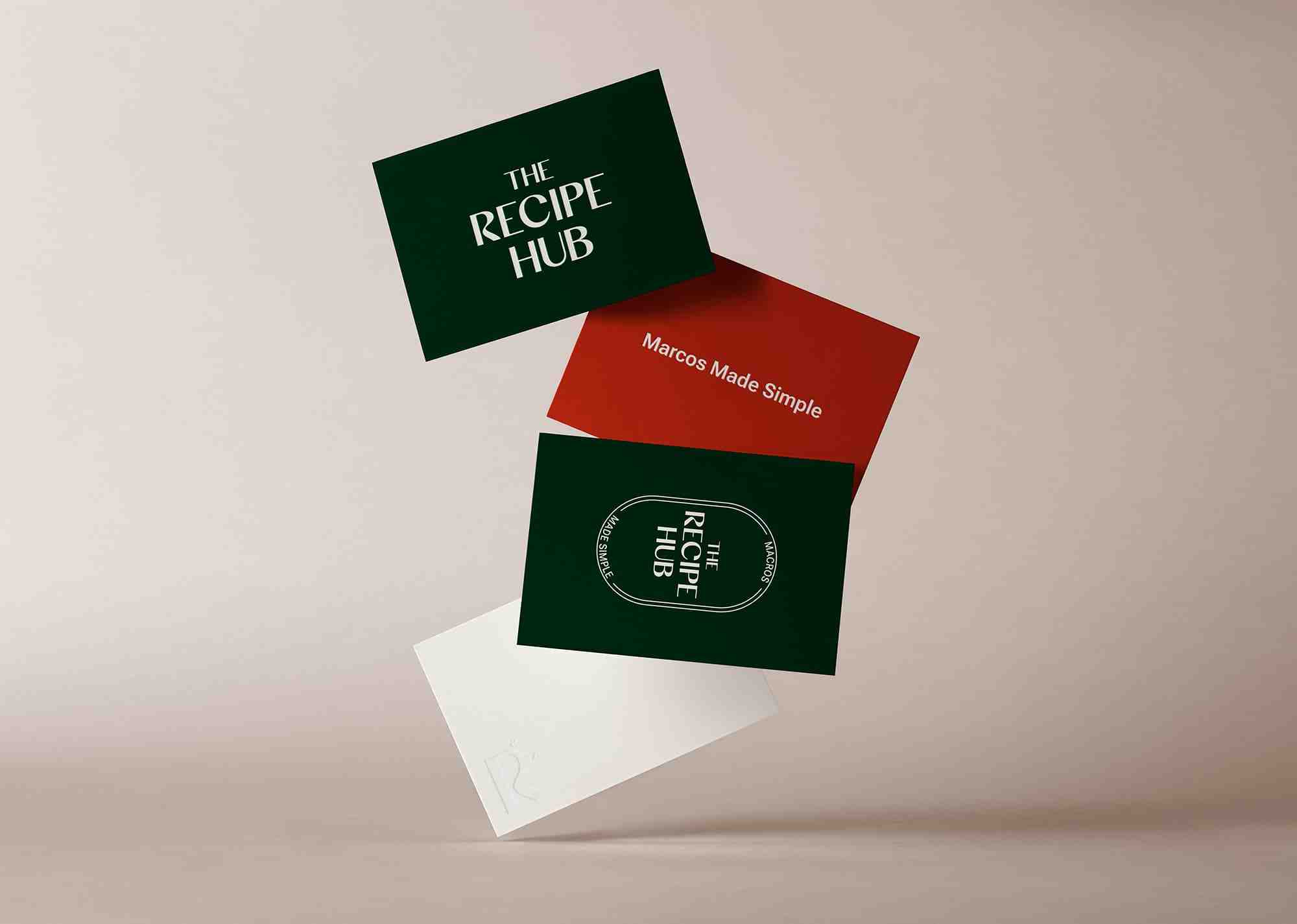
Two concept directions were then presented and narrowed to one, which was developed into the final identity. The chosen direction pairs a dark emerald green with a bone white, with the palette deliberately kept narrow so that food photography supplies the colour rather than competing with it. Accessibility was a stated requirement from the brief rather than a check at the end: colour values were set to meet WCAG contrast standards, on the reasoning that a palette which only works on a moodboard is not finished. The wordmark uses a display face with the supporting typography kept restrained, and the suite extends to an "R" monogram and a set of stamp lockups for the placements a wordmark cannot survive, such as an app icon and social avatars.
The engagement ended in a handoff rather than a file drop. The logo suite was supplied in CMYK and RGB across SVG, PNG, JPG and EPS, and the brand guidelines documented colour values, typography, logo usage, and a tone of voice section written specifically so that contributors other than Chloe could write as The Recipe Hub without losing their own personality. That system is what allowed the app to be designed later without reopening decisions about colour, type or voice.
Brand to product
Same wordmark, same palette, same voice.
The brand was delivered in 2025. The app it was built for launched on 23 June 2026.
- Return brief
- Two directions
- Colour system
- Logo suite
- Typography
- Tone of voice
01 06
Return brief
The first deliverable was a written interpretation of the brand - who it is for, what it is arguing for, and how it should sound - put back to the client for sign-off before any design work began. It converts a conversation into something that can be agreed or corrected.
02 06
Two directions
Two distinct concept directions were presented rather than one recommendation, so the choice was made against a real alternative. The selected direction was then refined into the final identity instead of being restarted.
03 06
Colour system
A dark emerald green paired with a bone white, kept deliberately narrow so that food photography carries the colour. Values were set to meet WCAG contrast standards because the palette had to work in a product, not only on a brand board.
04 06
Logo suite
A primary wordmark, an "R" monogram, and stamp lockups built around a fork and knife device for circular and square placements. Supplied in CMYK and RGB across SVG, PNG, JPG and EPS so print and digital both have a correct file.
05 06
Typography
A display face carries the wordmark and the supporting typography is kept plain, so the brand has personality in the places that need it and stays readable everywhere else - including long recipe method steps.
06 06
Tone of voice
The guidelines document how The Recipe Hub speaks: friendly, plain and practical, never technical or exclusive. It was written so that food creators other than Chloe could publish under the brand without either sounding like nobody or sounding like themselves alone.
Services in The Recipe Hub brand build
Frequently Asked Questions
A complete brand identity: a brand moodboard and two concept directions, a full logo suite in CMYK and RGB across SVG, PNG, JPG and EPS, and a brand guidelines document covering colour values, typography, logo usage, an overview of the company and its tone of voice.
The original name described the author rather than the product. The business was moving to a subscription platform with more than one food creator contributing, and selling to people who had never followed Chloe Condon on social media. A founder name does not extend to a roster of contributors, so the brand was rebuilt from the name outwards.
The Recipe Hub schedule ran roughly six weeks from the signed-off return brief to final delivery, including two rounds of client review. Timelines move with the number of decision-makers and the speed of feedback, which is why each stage in the schedule carries a date and a named owner.
Yes. This was a discrete branding engagement delivered on its own, roughly a year before the app went live. Where a product build does follow, having the brand settled first means interface design starts from agreed colour, type and voice instead of deciding them twice.
By treating the small sizes as the real test. Colour values are set against WCAG contrast standards, the palette is kept narrow so photography is not competing with it, and the suite includes a monogram and stamp lockups for placements such as app icons and avatars where a full wordmark would be illegible.
Brand colour values, typography, logo usage rules covering which mark to use where, a light overview of the company, and a tone of voice section. The purpose is that somebody who was not in the room can apply the brand correctly.
That was an explicit requirement of the brief. The tone of voice guidance was written so additional food creators can publish as The Recipe Hub - consistent in how ingredients are referenced and who the recipe is addressed to - while keeping their own personality.
Up next
More products we have designed, built and launched end to end.
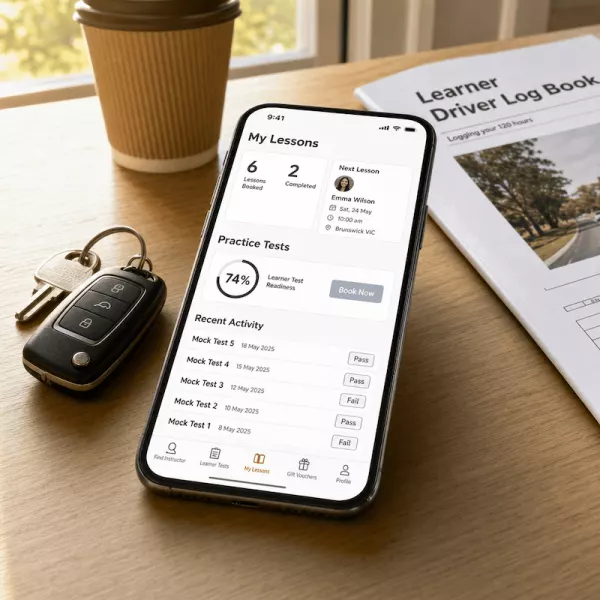
EzLicence UK From Australia to the United Kingdom
Taking a proven driving-lesson marketplace from Australia to the UK, localised for a new market from day one.
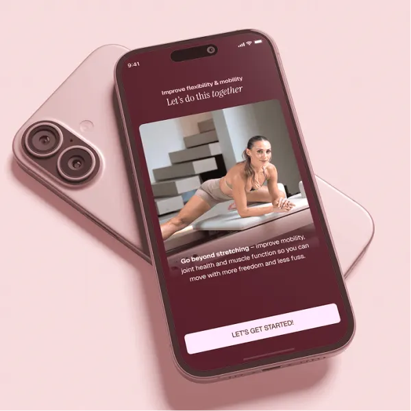
Pilates Obsession From Studio to Global Platform
How we turned Sara Colquhoun's studio expertise into a global Pilates platform in three months