App design services and UX/UI built to ship.

PixelForce sells app design services as Phase 1 Scoping and Design, typically $35,000 to $65,000 and buyable on its own. You leave with an enterprise-grade design system, every screen designed, a written blueprint and a fixed-cost quote for the build.

  • Phase 1 Scoping & Design from $35,000 - buyable alone
  • Traininpink: 4.91 App Store rating, number 1 in Italy
  • OpBill: 98 percent user satisfaction on the billing flow
  • Apple Best of Developers · Top Clutch UX Company
$35K-$65KPhase 1 Scoping & Design
98%First-time app store approval
100+Products shipped
50M+Users served

Three products where the design was the difference.

Good mobile app design is difficult to argue about in the abstract and very easy to see in the numbers, so here are three. Traininpink is the number one female-focused Pilates and fitness app in Italy, serving over 182,000 women with a 4.91 App Store rating, and since 2021 the platform has helped acquire over 40,000 paying subscribers. A 4.91 rating at that volume is not a marketing achievement, it is an interface people do not fight with. OpBill reduced medical billing from a desk task to a phone task with an AI-powered OCR claiming flow called Snap, Scroll, Done - billing 90 percent faster with 98 percent user satisfaction, built in 4 months. Revia reached number 3 in Apple's Health and Fitness category within 48 hours of launch after a 4-month build, in a category where a first impression is the only impression. Different markets, one pattern: the information architecture was settled before a single screen was styled, the design system existed before the second feature was designed, and every screen was drawn to be built rather than to be admired. That is what app design and UX/UI services look like when they are run by the team that also ships the code.

A 4.91 rating across 182,000 women.

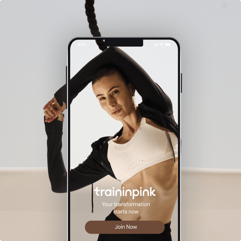
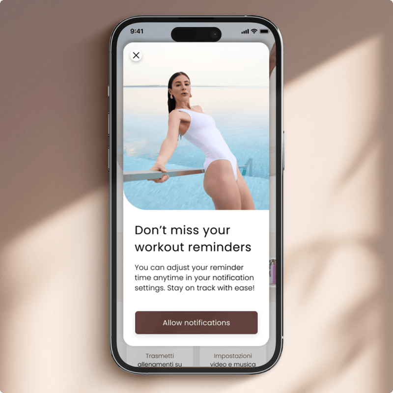
Traininpink is the number one female-focused Pilates and fitness app in Italy, serving over 182,000 women with a 4.91 App Store rating, and since 2021 the platform has helped acquire over 40,000 paying subscribers. App Store ratings are the most brutally honest usability testing available, because nobody leaves five stars for an interface that wasted their time. Getting there was a design problem before it was a development problem. The product had to work for someone opening it in a lounge room with a phone propped against a water bottle, in Italian, in the middle of a programme she started three weeks ago. That meant the information architecture had to make the next session obvious without a single tap of navigation, the typography had to survive being read from two metres away, and the whole visual system had to hold together as content grew from a handful of programmes to a library. None of that is decoration. It is the difference between an app people download and an app people rate.

Traininpink app home screen designed by PixelForce Traininpink app programme screen designed by PixelForce
Designed by PixelForce 4.91 App Store rating · number 1 in Italy

Recognised as a Top Clutch User Experience Company.

Independent recognition for the team behind Traininpink, OpBill, Revia and SWEAT - Top Clutch User Experience Company in Australia, Apple Best of Developers, and Apple Watch and TV App of the Year. Design recognition matters more on this page than anywhere else on the site, because design is the one service every agency claims to be good at and almost none can point to a third party who agreed. PixelForce also holds a 98 percent first-time app store approval rate across 100+ shipped products, which is a design credential as much as an engineering one: most first-submission rejections are interface, navigation and platform-convention problems rather than code defects. Behind that sits an AWS Advanced Tier Partnership with 15+ AWS-accredited engineers, a 99.99 percent uptime rate, and 50M+ users served across the products we have designed and built.

Apple Watch App of the Year
Clutch Top User Experience Company
Apple TV App of the Year
Apple Best of Developers
Clutch Top App Development Company
Clutch Top Software Developers
Australian Technology Services Achiever
Web Excellence Awards (Website)
Web Excellence Awards (App)
ACS Digital Disruptor Gold Award
Clutch Top Android App Development
Clutch Top iPhone App Development

Why clients choose our UX/UI design agency.

Four reasons founders, product owners and enterprise teams pick PixelForce over a pure design studio on one side and an offshore build shop on the other. The short version is that we sell design as a product you can buy on its own, and we design as the team that also has to build it. Those two facts remove the two failure modes that make most app design engagements disappointing: a beautiful deliverable nobody can build, and a discovery phase that exists only to justify a development contract. Everything below follows from them. If you are comparing UX/UI design companies, these are the four questions worth putting to every one of them.

Design you can buy on its own

Phase 1 Scoping & Design is a standalone commercial engagement, typically $35,000 to $65,000, and it is deliberately structured so it stands alone. You finish it owning the Business Requirements Document, the full design system, high-fidelity designs for every consumer screen and the key admin screens, the Product Requirements Document, and a fixed-cost Statement of Work for development. Those artefacts are portable - take them to your board, to investors, to an internal team, or to another development partner entirely. Intellectual property transfers to you. Nothing is withheld pending a build contract, which is the practical test of whether a design engagement is genuine or a sales step.

  • Standalone engagement, typically $35,000 to $65,000
  • BRD, PRD, design system and every screen
  • Fixed-cost SoW for the build, issued at the end
  • Intellectual property transfers to you

Designed by the team that builds it

The most expensive design deliverable in the world is the one an engineer cannot build to budget. Because PixelForce designs and develops under one roof, every screen is reviewed against what it costs to implement while it is still cheap to change, and the Product Requirements Document is approved by an Engineering Manager before the Statement of Work is written. That is why the development quote at the end of Phase 1 is fixed-cost rather than indicative. A pure design studio cannot offer that, because it never has to live with the estimate. Our 98 percent first-time app store approval rate across 100+ shipped products comes from the same place.

  • Design and engineering under one roof
  • Engineering Manager approves the PRD
  • Fixed-cost development quote, not indicative
  • 98% first-time app store approval across 100+ products

100% in-house Adelaide team

The people in your design workshops are the people drawing the screens. PixelForce runs 100% in-house design and development from an Adelaide headquarters, so there is no subcontracting chain between the conversation and the artboard, and no timezone gap turning a two-minute clarification into a two-day round trip. Design moves faster than any other phase of a project, because a single answer about a business rule can redraw four screens, so proximity is worth more here than anywhere else. Cadence is fixed and visible: squad sessions every 2 weeks and planning every 4 weeks, with reviews you attend rather than a deck that arrives by email.

  • 100% in-house design and development, Adelaide HQ
  • No subcontracting chain, no timezone gap
  • Squad every 2 weeks, planning every 4 weeks
  • Design reviews you attend, not a status email

Honest advice, including do not build

We never scope something a client cannot afford to build, and budget alignment happens at the first consultation rather than after a proposal lands. Every significant trade-off in Phase 1 is framed with the 1-3-1 method - one problem, three options with their consequences, one recommendation across budget, timeline and scope - so you are choosing rather than being sold to. Some clients complete Phase 1 and correctly decide not to build. That is a valid outcome here, and it is a cheaper one than discovering the same thing three months into development. Recommending against a build has been worth more to clients over 100+ shipped products than enthusiasm ever was.

  • Budget aligned at the first consultation
  • 1-3-1: one problem, three options, one recommendation
  • Deciding not to build is a valid outcome
  • Consequence-awareness across 100+ shipped products

App design services we deliver.

Six mobile app design services we have shipped repeatedly across iOS and Android - user research and information architecture, wireframing and interactive prototyping, visual UX/UI and interface design, design systems, app redesign and usability auditing, and the ongoing product design that follows a launch. These are the app design services most clients actually need, and mobile app design is the largest of them because a phone screen forgives nothing. Most engagements combine four or five of them inside a single Phase 1 Scoping & Design, sequenced rather than bought separately, because research that never reaches a wireframe and a wireframe that never reaches a specification are both wasted spend. Take one on its own if that is genuinely what you need. If your product is a website rather than an app, our website design and development service covers that ground, and MVP and startup app development covers the build that usually follows this page.

User research and information architecture

Before anything is drawn, we establish who the product is for and what they are trying to finish. User research means personas grounded in your actual audience rather than invented ones, a map of the jobs each persona needs to complete, and the information architecture that decides what lives where. Information architecture is the least visible and most consequential part of app design: it is why Traininpink users can find the next session without navigating, and it is the thing that quietly ruins products when it is skipped. For existing products the user research runs on data rather than opinion - analytics review, funnel drop-off data and app store feedback analysis - so the problems we design against are the ones users actually report.

  • User research and personas from your real audience
  • Jobs-to-be-done mapped per persona
  • Information architecture and navigation model
  • Analytics data and app store feedback review

Wireframing and interactive prototyping

Wireframes settle structure while structure is still cheap to change, and interactive prototypes let a real person try the flow before a sprint is paid for. We build clickable Figma prototypes of the journeys that carry the most commercial risk - onboarding, the core action, checkout or subscription - and put them in front of people who match the personas. A confused user in a prototype session costs an afternoon. The same confusion discovered after launch costs a redesign and a cohort of churned users. This is also where the full user journey is mapped end to end, so no screen arrives in development without a defined way in and a defined way out.

  • Low-fidelity wireframes for every screen
  • Clickable Figma prototypes of the risky journeys
  • Usability testing against the personas
  • Full user journey mapped end to end

Mobile app UX/UI and visual interface design

High-fidelity mobile app design for every consumer screen and the key admin portal screens, delivered development-ready. iOS work follows the Apple Human Interface Guidelines - tab bars, navigation bars, SF Pro typography and the iOS gestures users already have in their hands - while Android work follows Material Design, from a single shared brand language, so the product keeps one identity while feeling native on each platform. Every state is designed, not just the happy path - empty states, loading states, error states, offline states and the long-content cases that break layouts in production. Revia launched into Apple's Health and Fitness category and reached number 3 within 48 hours, which is a category where the screenshots on the store listing do half the selling.

  • Every consumer screen and key admin screens
  • iOS Human Interface Guidelines and Material Design
  • Empty, loading, error and offline states designed
  • Development-ready handoff, not a mood board

Design systems and component libraries

An enterprise-grade design system covering colour, typography, spacing, accessibility, iconography and a component library of buttons, inputs, cards, navigation and form patterns, with written documentation of how each component behaves. It is built as the screens are designed rather than retrofitted, which is the only way it stays accurate. The payoff arrives on feature three, not feature one: a new screen becomes an assembly job rather than a design job, and two designers produce work that looks like one product. The system is handed over as an editable Figma library you own, and it travels with you if the build goes elsewhere.

  • Colour, typography, spacing and accessibility tokens
  • Component library with written behaviour documentation
  • Built alongside the screens, not retrofitted
  • Editable Figma library, owned by you

App redesign and usability audit

For products that already exist and are underperforming. The audit combines heuristic evaluation of the current interface, analytics review to find where users actually stall, and analysis of app store reviews and support tickets for the problems users describe themselves. That produces a prioritised list ranked by commercial impact rather than by how dated something looks. We then redesign against the top of that list and sequence implementation incrementally, so improvements ship without a high-risk relaunch. Where the platform underneath is the real problem, we say so - Move With Us needed a rescue as well as a redesign, and came out with crash rates reduced 50 percent and user satisfaction up 30 percent.

  • Heuristic evaluation of the current interface
  • Analytics, review and support-ticket analysis
  • Problems ranked by commercial impact
  • Incremental rollout rather than a relaunch

Ongoing product design after launch

Launch is where the design work starts being informed by evidence rather than judgement. Phase 3 Post Launch Support covers it two ways. Warranty, Monitoring & Support is $4,000 per month for defect resolution under warranty, 24/7 monitoring, business-hours incident response and a monthly Platform Health Report, with technical support capped at seven hours per month. Most clients take the Product Retainer instead, which includes all of that and adds a roadmap workshop in month one, continuous sprints delivering designed features into production, and quarterly business reviews, priced per four-week cycle from Steady $10,000 to Momentum $50,000.

  • Warranty, Monitoring & Support from $4,000 per month
  • Product Retainer from $10,000 per four-week cycle
  • Roadmap workshop, then continuous design sprints
  • Design decisions driven by analytics, not opinion

Snap, Scroll, Done - and 98% satisfaction.

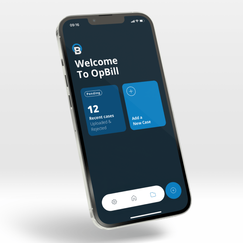
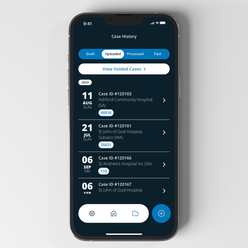
OpBill's AI-powered OCR claiming flow, named Snap, Scroll, Done, made medical billing 90 percent faster with 98 percent user satisfaction, built in 4 months. The name is the design. Three words describe the entire interaction, and a specialist who bills between patients can hold all three in their head without training. That is the whole discipline compressed into one example: the hard work was not the visual style, it was deciding that a claim should be a photograph rather than a form, and then designing everything else around that decision. Getting there required understanding what a clinician does in the ninety seconds between appointments, mapping how a claim actually moves once it leaves them, and then removing every screen that did not earn its place. Ninety-eight percent satisfaction from professionals whose previous billing workflow was a desk, a keyboard and a grievance is what happens when the information architecture is right before the interface is pretty.

OpBill medical billing app claiming screen designed by PixelForce OpBill medical billing app claim review screen
Designed by PixelForce 98% user satisfaction · billing 90% faster

How app design is scoped and priced.

Three engagement models, in the order they normally run, with Phase 1 as the one most people on this page are actually buying. Every figure below is an envelope shaped by scope, never a fixed quote off a rate card, which is exactly why Scoping & Design comes first and why no development quote is issued without it. Mobile app design cost is driven by screen count, number of user roles, whether an admin portal is in scope, integration complexity, and how much regulated or financial logic sits underneath. Read Phase 1 on its own first. It is a complete product with its own deliverables and its own reason to exist, and a genuine number of clients buy it and stop there, which is the point.

Phase 2 · Development, QA and Release

$100,000 to $350,000

The build against the signed Statement of Work, if you choose to proceed: foundation and authentication, backend services and cloud infrastructure, the app build across iOS, Android and any admin portal, internal QA against the PRD acceptance criteria, client User Acceptance Testing, then app store submission and launch. Design does not stop when this starts - the design team stays on the project through implementation review, so what ships matches what was approved rather than an engineer's interpretation of it. The $350,000 figure is a recommendation rather than a ceiling. Even with a larger budget we advise capping version one near it and spending the rest on evidence-led iteration afterwards, because a bigger budget should buy a longer runway rather than a bigger first release.

  • Fixed scope against the signed SoW
  • Design team stays on through implementation review
  • Internal QA, then client UAT, then submission
  • $350,000 is a recommendation, not a ceiling

Phase 3 · Post Launch Support

From $10,000 per 4 weeks

Two ways to engage after launch. Option 1, Warranty, Monitoring & Support, is $4,000 per month and covers critical-bug defect resolution under warranty, 24/7 infrastructure monitoring, business-hours critical incident response, update notifications with costs stated upfront, and a monthly Platform Health Report, with technical support capped at seven hours per month. Option 2, the Product Retainer, includes everything in Option 1 and adds a Product Roadmap Workshop in month one, continuous product sprints delivering designed features into production, structured sprint planning, and quarterly business reviews. It is priced per four-week cycle against a committed story-point capacity: Steady $10,000, Growth $20,000, Scale $30,000, Velocity $40,000, Momentum $50,000, Enterprise on application. Most launched products need design capacity, not just protection, which is why the retainer is where the longest partnerships live.

  • Option 1 - Warranty, Monitoring & Support, $4,000 per month
  • Option 2 - Product Retainer, from $10,000 per four-week cycle
  • Option 2 includes everything in Option 1
  • Roadmap workshop, then continuous design sprints

Everything you walk away with.

Six deliverables that make up a completed Phase 1 Scoping & Design, listed in the order they are produced. This is the part worth reading closely if you are comparing UX/UI design services, because the price differences you see between agencies are almost entirely explained by which of these six are actually included. A quote that covers iOS screens but no Android adaptation, screens but no design system, or Figma files but no written technical specification, is not cheaper - it is smaller. Every item below is handed over as an artefact you own outright, including the source data behind the research.

Blueprint Preliminaries

The structured brief you complete before the workshops, so the first session starts from your business rather than a blank page.

  • Business objectives and commercial goals
  • Target users and the problem being removed
  • Success metrics defined before design starts
  • Design preferences and brand direction
  • Success sliders across six levers

Two strategic workshops

Focused working sessions rather than presentations. Workshop one covers business requirements, workshop two covers product requirements, design direction and the scope of version one.

  • Business requirements settled first
  • Product requirements and design direction
  • Scope of version one agreed on the record
  • Priorities locked, trade-offs written down
  • Run by the team that would build it

Business Requirements Document

The commercial lens applied to every later feature decision, replayed to you with three costed options under the 1-3-1 method before it is signed off.

  • Business goals and target users
  • The problems the platform must solve
  • Outcomes the product has to achieve
  • Three options, one recommendation
  • The reference for every scope argument later

Enterprise-grade design system

The foundation everything else is assembled from, delivered as an editable Figma library with written documentation of how each component behaves.

  • Colour system and typographic scale
  • Spacing tokens and layout grid
  • Accessibility standards baked in
  • Iconography and component library
  • Written behaviour documentation

High-fidelity UX/UI designs

Every consumer screen and the key admin portal screens, development-ready, with the full user journey mapped end to end and every state designed rather than only the happy path.

  • Every consumer screen at high fidelity
  • Key admin portal screens included
  • Empty, loading, error and offline states
  • iOS and Android platform conventions applied
  • Full user journey mapped end to end

PRD and fixed-cost SoW

The technical blueprint covering everything that cannot be captured visually, plus the fixed-cost development contract that Phase 1 exists to make possible.

  • Feature logic and business rules
  • Integrations and technology choices
  • Engineering Manager technical review
  • Fixed-cost, fixed-scope SoW for the build
  • Full schedule, milestones and deliverables

One conversation.
Three phases.
Built to grow.

The same canonical PixelForce engagement model behind 100+ shipped products and $1.5B+ in combined client revenue, applied to your app design. The 1-3-1 method runs through every conversation - one problem, three options with honest trade-offs across budget, timeline and scope, one recommendation. No Blueprint, no Build.

  1. 0
    Free

    Discovery call

    A free, no-obligation conversation to find the right path for your app design before you commit a dollar.

    • Mutual NDA signed up front
    • 1-3-1 method: one problem, three options, one recommendation
    • Honest trade-offs across budget, timeline and scope
    • A straight answer on what a credible build looks like
  2. 1
    4-8 weeks

    Scoping & Design

    Everything you need to build with total confidence - a fully costed, designed plan with no scope surprises.

    • Strategic workshops and BRD
    • Full UX/UI design system, every screen built
    • PRD and a fixed-cost Statement of Work
    • No Blueprint, no Build - Phase 1 before any Phase 2 quote
  3. 2
    3-6 months

    Development, QA and Release

    From approved designs to your live app design, built and tested at a steady sprint cadence.

    • Sprint cadence with regular demos
    • QA across iOS, Android and the edge cases
    • End-to-end App Store and Google Play submission
    • Built to scale from 1,000 to 1,000,000 users
  4. 3
    Ongoing

    Post Launch Support

    We do not disappear at launch - monitoring, warranty, and an optional retainer keep your app design growing.

    • 24/7 monitoring and a critical-defect warranty
    • Ongoing technical support
    • Optional Product Retainer: four-week sprints and quarterly reviews
    • The model that grew SWEAT to a $400M platform

App design and UX/UI case studies.

Selected app design work, designed and built by a 100% in-house Adelaide team. Read these for the decisions rather than the screenshots - what the information architecture had to solve, which screens were cut before development, and what the first month of real usage changed. Between them they cover the situations that bring people to a mobile app design company most often: a founder with an audience and no product, an established business whose interface is now the bottleneck, and a platform that needs a redesign rather than a rebuild.

The Recipe Hub

The Recipe Hub From recipe feed to nutrition platform

Gold Coast, Australia The Recipe Hub

From a 100,000-strong recipe following to a subscription nutrition app on iOS and Android.

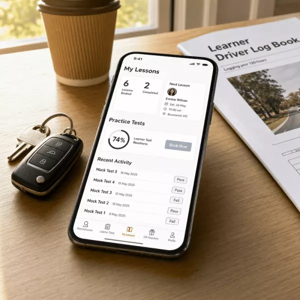
EzLicence

EzLicence Connecting Learners & Instructors

Adelaide, Australia EzLicence

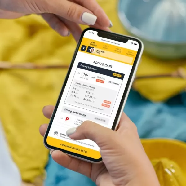
How we built EzLicence, Australia's largest marketplace for driving lessons

NKO Club

NKO Club A Country Club for Misfits

United States NKO Club

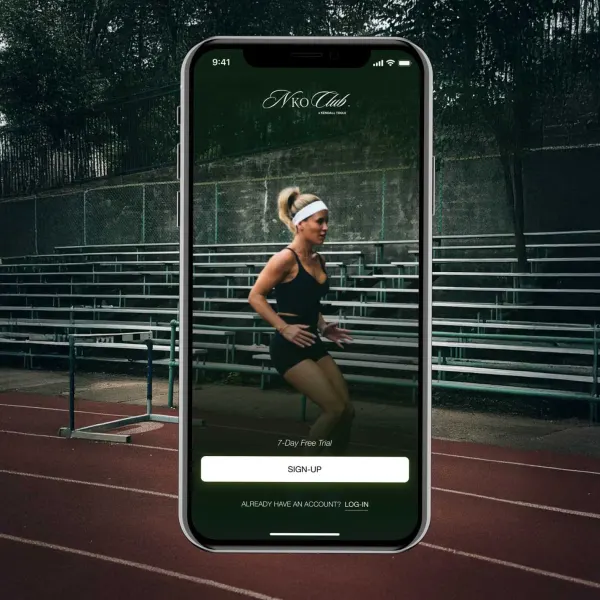
How we built Kendall Toole's holistic wellness platform - movement, mindset and nutrition - in five months

Jones Radiology

Jones Radiology Proving the product before committing to it

Adelaide, Australia Jones Radiology

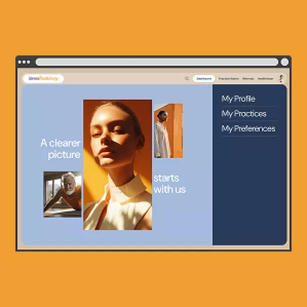
A working prototype first, so the hard decisions were made before the expensive ones.

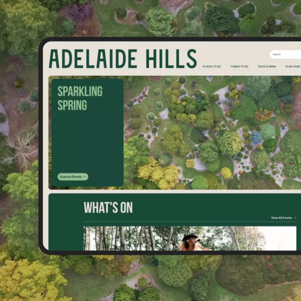
Adelaide Hills Tourism

Adelaide Hills Tourism A region, not a brochure

Adelaide, Australia Adelaide Hills Tourism

One destination website carrying a whole region's operators, events and trails.

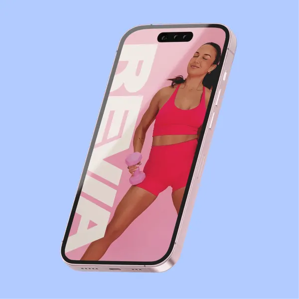
Revia

Revia Hybrid training, without the intimidation

Brisbane, Australia Revie Jane

How we built Revia and put it at number 3 in Apple's Health and Fitness category within 48 hours of launch.

The Recipe Hub Branding

The Recipe Hub Branding From founder name to platform brand

Gold Coast, Australia The Recipe Hub

From a founder's name to a brand a whole platform could stand on.

PRASA

PRASA Regulate, support, advise

Adelaide, Australia Pharmacy Regulation Authority SA

A regulator's website where finding the right form is the whole job.

EzLicence UK

EzLicence UK From Australia to the United Kingdom

United Kingdom EzLicence

Taking a proven driving-lesson marketplace from Australia to the UK, localised for a new market from day one.

Schnuzzle

Schnuzzle Selling a sense you cannot photograph

Adelaide, Australia Schnuzzle

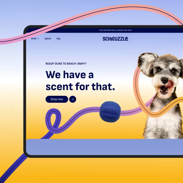
A store built to sell a product nobody can smell through a screen, with a 200 percent return on investment within the launch period.

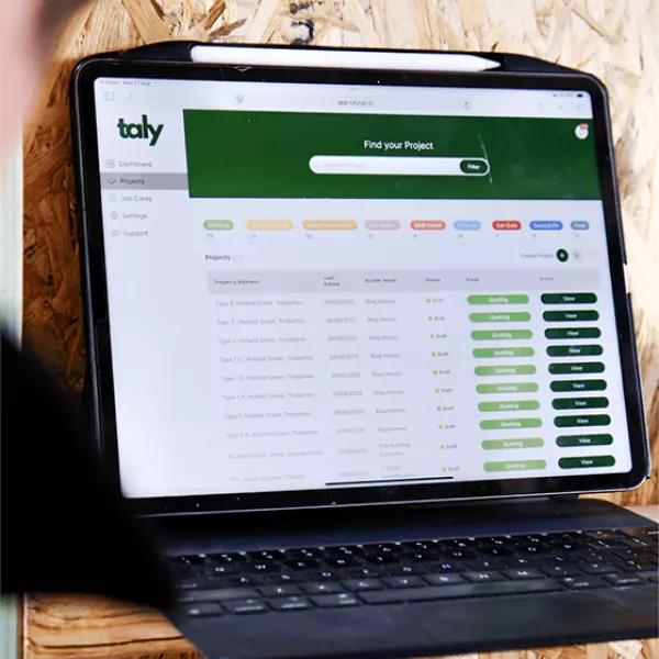
Taly

Taly Off the paper plan, into one platform

Adelaide, Australia Taly

The plan, the job card and the numbers in one place, live for the office and the site at once.

littlegren

littlegren A living product, sold online

Adelaide, Australia littlegren

A Shopify store built for a product people buy with their eyes, and sales that increased 300 percent year on year.

App design and UX/UI questions.

The questions clients ask before committing to a design engagement - what app design costs, how long it takes, whether we design for both iOS and Android, what a design system is and whether you need one, whether we can redesign an existing app, what tools we use, what ongoing design support looks like after launch, whether design can be bought without the development, what agencies typically charge, what our process actually is, and what you own at the end. If your question is not here, ask it on a discovery call. Scoping questions are exactly what that call is for.

App design at PixelForce is Phase 1 Scoping & Design, and it is typically $35,000 to $65,000 as a standalone engagement. That figure is an envelope shaped by scope rather than a fixed quote off a rate card, which is why we settle it in a discovery conversation before anything is signed. What moves it is the number of consumer screens, whether an admin portal is in scope, how many user roles the product carries, how much regulated or financial logic sits underneath, and whether brand development is included.

What you receive is fixed regardless of where in the range you land: the Blueprint Preliminaries covering business objectives, target users and success metrics; two strategic workshops covering business requirements, product requirements, design direction and the scope of version one; a Business Requirements Document; an enterprise-grade design system covering colour, typography, accessibility, iconography and components; high-fidelity designs for every consumer screen and the key admin portal screens; a Product Requirements Document; and a fixed-cost Statement of Work for development.

Phase 1 is a separate commitment on purpose. You can buy it, take the blueprint and decide about the build afterwards, including deciding not to build at all. No development quote is ever issued without a completed Phase 1. That is what we mean by No Blueprint, no Build.

App design at PixelForce is Phase 1 Scoping and Design, and its duration is agreed at kickoff rather than published, because screen count, user roles, admin portal scope and your own approval speed all move it.

Phase 1 Scoping & Design runs to a schedule agreed at kickoff rather than a published number of weeks, because the length is driven by the same things that drive the price - screen count, number of user roles, admin portal scope, integration complexity, and how quickly your stakeholders can review and approve.

The shape of it is consistent every time. Preliminaries first, so the workshops start from your business objectives rather than a blank page. Then design workshop one and design workshop two. Then the Business Requirements Document, replayed to you with option 1, option 2 and option 3 laid out under our 1-3-1 method - one problem, three options with their consequences, one recommendation across budget, timeline and scope. Then the design system and high-fidelity screens in Figma, the Product Requirements Document with Engineering Manager technical review, and finally the Statement of Work.

Cadence is fixed and visible throughout: squad sessions every 2 weeks and planning every 4 weeks. What we will not do is compress design to hit an arbitrary date, because a rushed blueprint is paid for later in development rework. For context on what a properly scoped programme produces afterwards, Pilates Obsession went live within 12 weeks and on budget, and Revia reached number 3 in Apple's Health and Fitness category within 48 hours of launch after a 4-month build.

PixelForce designs app experiences for both iOS and Android from a single brand language, following the Apple Human Interface Guidelines on one platform and Material Design on the other.

Yes. We design platform-native experiences for both, from a single visual brand language.

iOS design follows the Apple Human Interface Guidelines - tab bar navigation, navigation bar patterns, SF Pro typography, system iconography, and the gestures iPhone users already have in their hands. Android design follows Material Design - bottom navigation, the floating action button, Material You colour systems, and Android-specific back and navigation conventions.

The approach is one brand, two dialects. Colour, typography, tone of voice and the component library are shared, and the platform-specific adaptations sit on top. That keeps your brand identity intact while the app still feels native on each device, which matters for App Store and Google Play review as much as it matters for users. PixelForce holds a 98 percent first-time app store approval rate across 100+ shipped products, and platform-convention compliance is a large part of why.

Designing for both platforms is more work than designing for one, because the research, information architecture and wireframes are shared but the visual adaptations are not. Whether you need both on day one is a scope question we answer in Phase 1 rather than assume. If a single cross-platform build answers your question, we will say so - see our Flutter app development service for that path.

A design system is a library of reusable components, patterns and guidelines that keeps a product consistent as it grows. It includes colour systems, a typographic scale, spacing tokens, iconography, a component library covering buttons, inputs, cards and navigation, a pattern library covering forms and flows, and the documentation that tells a developer how each piece behaves.

You need one when you are planning multiple features or phases, when more than one designer or developer will touch the product, when you expect the product to grow, or when you need design and development to move faster than a screen-by-screen handover allows. You do not need much of one for a genuinely small, single-release build with 10 to 15 screens, one designer and one developer, that is not going to evolve.

At PixelForce the answer is usually simple, because an enterprise-grade design system is part of Phase 1 Scoping & Design rather than a separate purchase. It is built as the screens are designed, not retrofitted afterwards, and it is handed over as an editable Figma library that your team owns. If you later take the build elsewhere, the system goes with you.

PixelForce redesigns existing apps, starting with an audit of the current experience, the analytics and the app store reviews rather than a mood board, then redesigning against a prioritised list of real problems.

Yes. App redesigns are one of the most common ways clients arrive here - a product that works but converts badly, an interface that has drifted away from current iOS and Android conventions, or a design that has accumulated a decade of unplanned additions.

The process starts with an audit rather than a mood board: heuristic evaluation of the current experience, a review of your analytics to find where users actually stall, and analysis of app store reviews and support tickets for the problems users describe in their own words. That produces a prioritised list of problems ranked by impact, not by how annoying they are to look at. We then redesign against the top of that list, usability test the redesign, and sequence implementation so improvements ship incrementally rather than as one high-risk relaunch.

A redesign is often the cheaper move, because the existing features, data and infrastructure survive. Where the underlying platform is the real problem, the honest answer is a rescue rather than a repaint - Move With Us came to us with a 200,000+ user platform, and after our work crash rates reduced 50 percent, app performance improved 40 percent, user satisfaction rose 30 percent, and there was zero business interruption during the fix. Redesign scope is priced the same way as any Phase 1: an envelope settled at discovery, never a number off a rate card. See app rescue and modernisation if the platform underneath is the issue.

PixelForce runs app design in Figma for wireframes, high-fidelity design, prototypes, the design system and developer handoff, alongside analytics tools for understanding behaviour and Jira and Confluence for delivery documentation.

Figma is the primary design tool - wireframes, high-fidelity visual design, interactive prototypes, the design system, and developer handoff all live there. It is the industry standard for a reason: your team can watch the design evolve in real time rather than waiting for a PDF, and comments land against the exact component being discussed.

For understanding behaviour we use analytics platforms such as Google Analytics for user flows and funnels, and Hotjar for heatmaps and session recordings when we are diagnosing an existing product. For delivery and documentation we run Jira and Confluence, so every design decision has a written trail you can read months later.

What you receive at the end is not a set of screenshots. You get the editable Figma files, exported assets in PNG and SVG, written design specifications, and the documentation in Confluence. All of it is yours. Nothing is held hostage against a development contract, which is the point of selling Phase 1 as a standalone engagement.

PixelForce provides ongoing design support after launch through Phase 3, either Warranty, Monitoring and Support at $4,000 per month or a Product Retainer priced per four-week cycle from Steady at $10,000 to Momentum at $50,000.

Yes, through Phase 3 Post Launch Support, and there are two ways to engage.

Option 1, Warranty, Monitoring & Support, is $4,000 per month. It covers critical-bug defect resolution under warranty, 24/7 infrastructure monitoring with proactive alerts, business-hours critical incident response, update notifications with cost implications stated upfront, and a monthly Platform Health Report, with technical support capped at seven hours per month. It is protection without the complexity, and it is the right choice if the product is stable and you are not shipping new design work.

Option 2, the Product Retainer, includes everything in Option 1 and adds the design and build capacity most launched products actually need: a Product Roadmap Workshop in month one, continuous product sprints delivering designed features into production, structured sprint planning, and quarterly business reviews. It is priced per four-week cycle against a committed story-point capacity - Steady $10,000, Growth $20,000, Scale $30,000, Velocity $40,000, Momentum $50,000, and Enterprise on application.

Most clients move to the retainer, because launch is the beginning of the design work rather than the end of it. The first month of real usage almost always changes something in the roadmap, and the retainer is the only option that can act on it.

You can buy app design from PixelForce without committing to the development, because Phase 1 Scoping and Design is a standalone engagement, typically $35,000 to $65,000, and every artefact it produces is portable.

Yes, and a meaningful number of clients do exactly that. Phase 1 Scoping & Design is a standalone commercial engagement, typically $35,000 to $65,000, and it is deliberately structured so it stands on its own.

At the end of it you own the Business Requirements Document, the enterprise-grade design system, high-fidelity designs for every consumer screen and the key admin screens, the Product Requirements Document, and a fixed-cost Statement of Work for the build. Those artefacts are portable. You can take them to your board, to investors, to an internal engineering team, or to another development partner entirely, and they will be able to price and build from them.

We structure it this way for two reasons. The first is that it removes the conflict of interest that makes discovery worthless everywhere else: if the design phase only exists to justify a build, it will always recommend a build. The second is that a blueprint is genuinely useful evidence. Some clients finish Phase 1 and correctly decide not to build, and that outcome saved them the far larger number. Declining a project, or recommending against building, is a valid answer here.

Agency rates for UX/UI design vary enormously across the market and are the wrong basis for comparison, because two firms quoting the same rate can deliver very different amounts of finished, development-ready design.

Rates across the market vary enormously, and the honest answer is that hourly and day rates are the wrong thing to compare, because two agencies quoting the same rate can deliver wildly different amounts of finished, development-ready design.

PixelForce prices design as an outcome rather than as time. Phase 1 Scoping & Design is typically $35,000 to $65,000 for a defined and fixed set of deliverables: preliminaries, two strategic workshops, the Business Requirements Document, the full design system, high-fidelity designs for every consumer screen and the key admin screens, the Product Requirements Document, and a fixed-cost Statement of Work for development.

When you are comparing quotes, the questions worth asking are these. Does the price include a design system, or only screens? Does it include the admin portal, or only the consumer app? Does it produce a written technical specification a developer can build from, or only Figma files? And does it end with a fixed-cost development quote, or with another conversation about scope? Those four answers explain almost every price difference you will see.

The PixelForce app design process is seven steps in the same order every time: preliminaries, two strategic workshops, the Business Requirements Document and replay, UX/UI design in Figma, the Product Requirements Document, then the Statement of Work.

Seven steps, in the same order every time.

1. Preliminaries. You complete the Blueprint Preliminaries covering business objectives, target users, success metrics, design preferences and success sliders - eighteen points distributed across six levers, so we know whether speed, budget or scope is the one that cannot move.

2. Strategic workshop one. Business requirements. What the product must achieve commercially, who it is for, and what problem it removes.

3. Strategic workshop two. Product requirements, design direction and the scope of version one. Priorities locked, trade-offs agreed on the record.

4. Business Requirements Document and replay. We write it up and replay it to you with three options under the 1-3-1 method - one problem, three options with their consequences, one recommendation across budget, timeline and scope.

5. UX/UI design in Figma. The design system first, then high-fidelity designs for every consumer screen and the key admin portal screens, with the full user journey mapped end to end.

6. Product Requirements Document. The technical blueprint - feature logic, integrations, technology choices, and everything that cannot be captured visually - reviewed and approved by an Engineering Manager.

7. Statement of Work and final review. A fixed-cost, fixed-scope development contract with schedule, milestones and deliverables, plus stakeholder review and approval.

The whole process is run by the same 100% in-house Adelaide team that would build the product, which is why the designs are development-ready rather than aspirational.

At the end of a PixelForce Phase 1 design engagement you own everything produced during it, without conditions, including the editable Figma files, the design system, the written documents and the intellectual property in the work.

Everything produced during Phase 1, without conditions.

Specifically: the editable Figma files including the full design system and every high-fidelity screen; exported assets in PNG and SVG; the Business Requirements Document; the Product Requirements Document; the written design specifications; the Confluence documentation; and the fixed-cost Statement of Work for development. Intellectual property in the work transfers to you.

There is no licence that lapses, no source file withheld pending a development contract, and no dependency on PixelForce to interpret the deliverables. That is the practical test of whether a design engagement is genuinely standalone or merely a sales step, and it is worth asking every agency you shortlist the same question before you sign anything.

Choosing an app design agency comes down to what you receive at the end. Ask whether the engagement produces a design system, a written specification a developer can build from, and source files that become yours outright.

What is actually in the deliverable? Compare scope rather than day rates, because two agencies quoting the same rate can hand over very different amounts of finished work. Does the price include a design system or only screens? Every consumer screen, or a representative sample? The admin portal, or only the consumer app? Those four answers explain most of the price differences you will see.

Does it end in something buildable? Figma files on their own are not a specification. Ask whether the engagement produces a written product requirements document covering feature logic, integrations, edge cases and the decisions that cannot be expressed visually, and ask whether an engineer reviews it before handover. Design that has never been read by a developer tends to be redrawn during the build.

Who owns the files? Ask directly whether the editable source files, the design system and the documentation transfer to you unconditionally, or whether they are held against a subsequent development contract. That is the practical test of whether a UX design agency is selling design or selling a step in a sales process.

Is there research behind the decisions? Ask how they decide what to design, whether through user research, analytics, usability testing or app store review analysis, and ask to see the evidence trail on a past project. A portfolio of attractive screens says nothing about whether those screens worked.

Do they design for the platform or against it? Ask how they handle the differences between the Apple Human Interface Guidelines and Material Design. Platform-convention compliance affects App Store and Google Play review outcomes, not only how the product feels in the hand.

What happens if the answer is not to build? A design engagement that exists only to justify a development contract will always recommend one. Ask whether the agency has ever advised a client not to proceed, and what happened next.

For reference, at PixelForce Phase 1 Scoping and Design is a standalone engagement, typically $35,000 to $65,000, and the design system, the high-fidelity screens, the Business Requirements Document, the Product Requirements Document and the editable Figma files are all yours whether or not you go on to build with us.

No Blueprint, no Build.

Every PixelForce product starts with Phase 1 Scoping & Design, and it is a genuine standalone purchase - typically $35,000 to $65,000. Two strategic workshops, a Business Requirements Document, an enterprise-grade design system, high-fidelity designs for every consumer screen and the key admin screens, a Product Requirements Document, and a fixed-cost Statement of Work for development. Buy the design on its own, take the blueprint wherever you want, and decide about the build afterwards.

  • Phase 1 Scoping & Design, $35,000 to $65,000
  • Top Clutch User Experience Company · Australia
  • 100% in-house design and development · Adelaide HQ
  • Apple Best of Developers, Watch and TV App of the Year