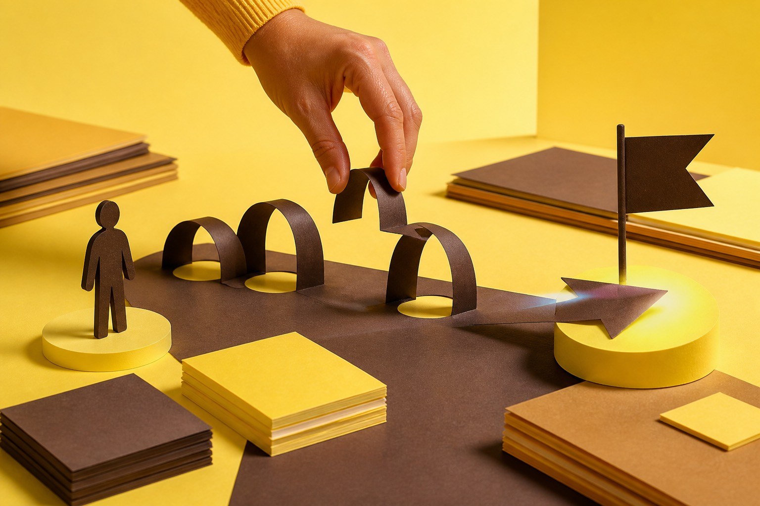
User experience is how a person feels while moving through a website, and most of it is decided before anyone forms an opinion about how the site looks. It is not decoration applied at the end of a build. It is whether someone can do the thing they came to do without thinking about the interface, and it is measurable in how many of them succeed.
Three characteristics carry most of it
Efficiency, intuitiveness and empathy. They are not a framework so much as the three ways a site usually fails.
Efficiency: respect how little time you get
Visitors decide whether a page is worth their attention in seconds, and they are rarely browsing for pleasure. The purpose of the page should be obvious and reachable without hunting. Contact details, opening hours, prices and the primary action belong where people look first, not behind a menu that rewards exploration.
Speed is part of this and is often the whole of it. For Pilates Obsession we built a platform where users take their first class within 30 seconds and videos load in under two seconds. That is a user experience outcome achieved through infrastructure decisions, not through visual design.
Intuitiveness: match what people already expect
People arrive carrying habits formed on every other site they have used. A logo in the top left returns you home. An underlined word is a link. A magnifying glass opens search. Breaking those conventions costs attention every time, and the novelty almost never pays for itself.
The clearest sign of a site that is not intuitive is a page where the interface itself becomes the subject - double-tapping a photo expecting it to zoom and having it do something else entirely, or a video that plays sound without being asked.
Empathy: design for the state people are actually in
Empathy in this context is unglamorous. It means assuming your visitor is on a phone, on a poor connection, possibly one-handed, possibly interrupted, and not especially interested in your navigation scheme. It means error messages that say what went wrong and how to fix it. It means not asking for information you do not need, and not asking twice.
It also means accessibility, which is the same discipline applied to people whose circumstances are permanent rather than momentary. Sufficient colour contrast, text that scales, forms that work with a keyboard - these help the person in bright sunlight as much as the person using a screen reader.
How to find your own UX problems
Watch someone use the site without helping them. Give one person one real task, stay quiet, and note every point where they pause. That single exercise reliably surfaces more than a redesign brief, because the problems are almost never the ones being argued about internally.
OpBill is the version of this that scales: the AI-powered claiming flow we built made medical billing 90 percent faster with 98 percent user satisfaction. The gain came from removing steps, not from restyling them.